SlashDB is excited to share a practical demonstration of how SlashDB API can be used with business intelligence tools to quickly and efficiently interpret data. SlashDB API allows remote data to be pulled in without having to install a driver from an SQL server database or complicated VPN setup. In our example video, we use TIBCO Spotfire to highlight how easily data from SlashDB API can be extracted and used with industry standard business intelligence tools to delve into data and spot trends. Watch the video (open the video in full screen for best viewing) or read below for a step-by-step recap.
How to Analyze Data from SlashDB API with TIBCO Spotfire
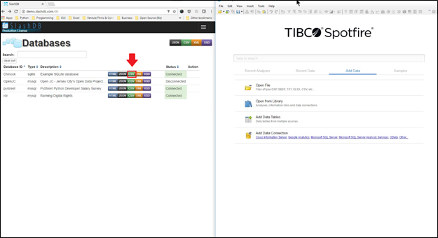
1. Right-click CSV in SlashDB API to copy the URL to data.
- TIBCO Spotfire supports a variety of data sources, but the quickest way to get started is to through CSV.
- Click on the Open File, the file dialog box opens.
2. Copy and paste the SlashDB URL into the file dialog box and remove the limit at the end (for example, limit = 29) and replace it with .csv.
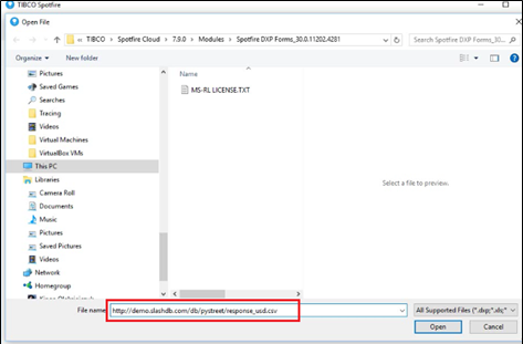
3. Accept to load the data.
- TIBCO Spotfire parses the data and infers the data types.
4. Explore the data.
- As soon as you start clicking links, TIBCO Spotfire starts making guesses with recommended visualizations about what you want to know about the data. In our example video, it generated a histogram of salary.
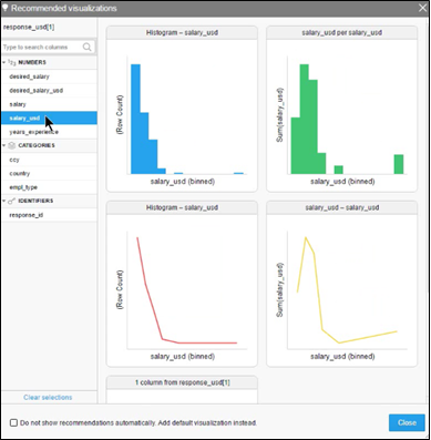
5. Click the Histogram to add it to your canvas.
6. Click the Close button to close TIBCO Spotfire’s suggestions.
- The Salary Histogram row count is based on the number of respondents per different salary range.
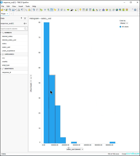
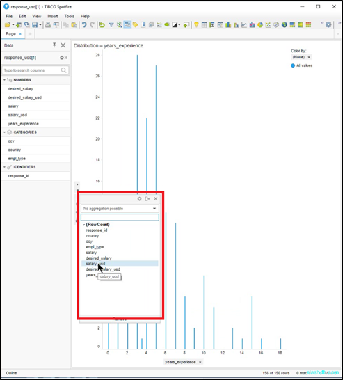
- You can select to re-filter the Histogram data from the drop-down menus for the X and Y values. In our example video, we selected Years of Experience from the X-value menu and changed data criteria from Sum to Average.
7. Click the X-value drop-down menu and select Years of Experience.
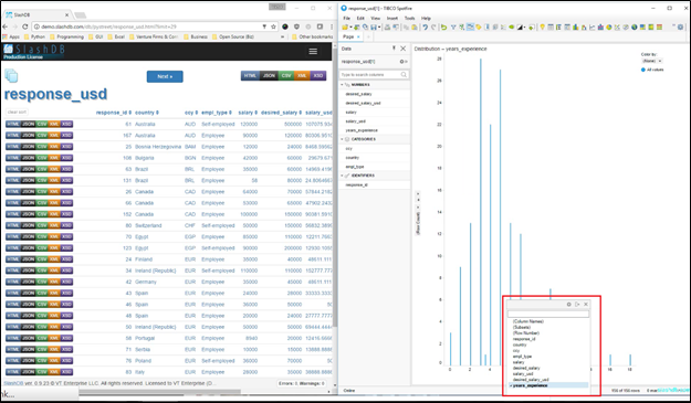
8. Change the X-value data criteria from Sum to Average.
9. Click the Y-value drop-down menu and select Average Salary.
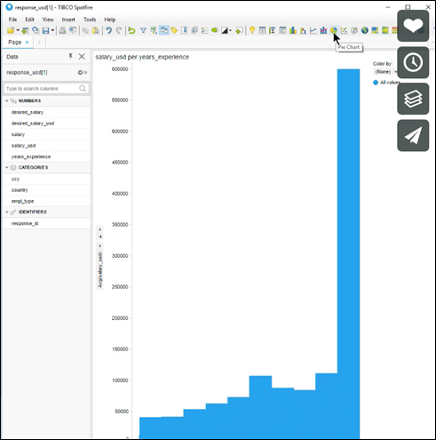
10. Right-click the X-value menu and select Auto-bin Column.
- The Salary Histogram updates and clearly shows that people with more experience have higher salaries. The Salary Histogram shows a clear up slope trend in this analysis.
What else can you do?
1. Select the Pie Chart icon from the top menu.
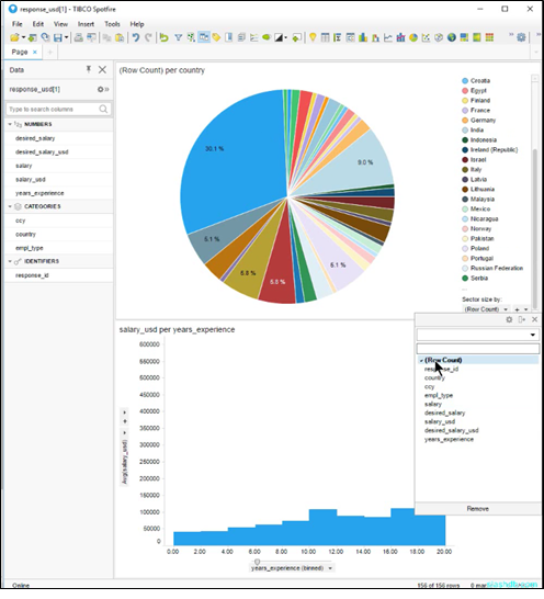
- Without setting any parameters, the pie chart created features the sum (salary) per country. In our example video, we change this to the number of respondents per country.
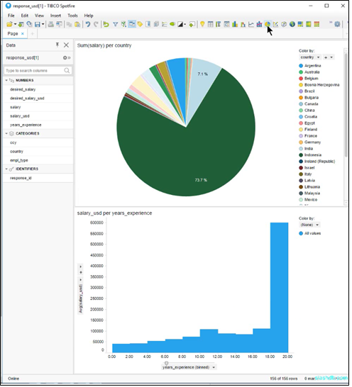
2. Select Row Count from the drop-down menu under Sector size by:
- The pie chart now shows the highest number of respondents are from the United States followed by India.
SlashDB
If you think SlashDB API is for you, Get /DB now. We provide the option to select different formats based on your needs. Options are:
- Ubuntu/ Debian
- VMWare
- Docker
- VirtualBox
- Vagrant
- Amazon Web Services Marketplace
- Azure

Remember, SlashDB is FREE for developers. Join our mission to make data retrieval a highly accessible, searchable, and intuitive process. Contact us at SlashDB and we’ll work with you to find the best API add-on configuration for your business needs.
